
Album cover design for the band Waterdeer. The brief was to create something with ‘no people, no animals and not too many colours’. I took inspiration from cyanotypes, using the lyrics, themes and feel of the music to drive my image research.
I was tasked with developing an identity for Communities of Liberation, a historical research and public art project which aims to increase awareness of the long history of the African presence in the borough of Tower Hamlets, by focusing specifically on excavating and sharing stories of individuals who lived here in the 17th and 18th centuries.

Exhibition design of 7 1×2m monoliths to walk visitors through the complex work of the co-producers of this project. We also created a coffee table book of their work as a companion piece.

Full box design, including all over pattern work, set up for gold foil and embossing, typesetting of labels and preparation for production.

Design, layout and typesetting for this long format delve in to all the ephemera included in the Tower Hamlets Library and Archives ‘Cockney Rebels’ exhibition running Q3 2024 - Q1 2025
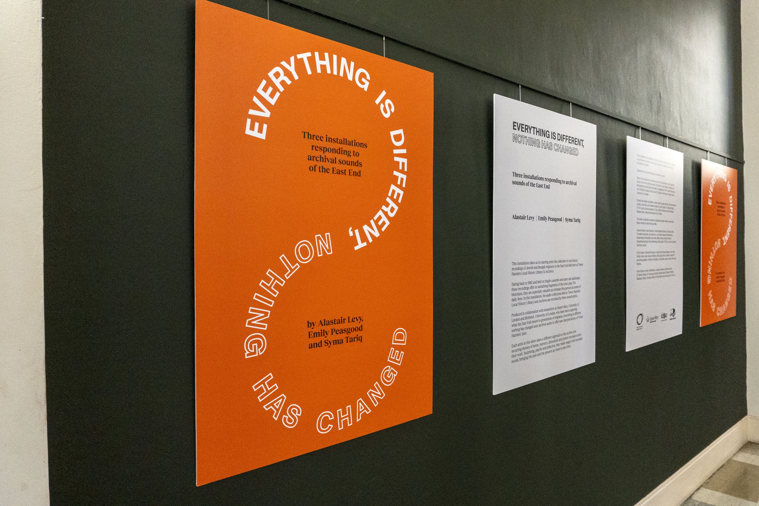
I worked with the Tower Hamlets Library and Archives team to put together a full identity for their late summer audio visual exhibition 'Everything is different, nothing has changed'. This included the design and production of wayfinding and information panels for the exhibition itself, marketing online and in print across the borough, as well as a programme for the event.
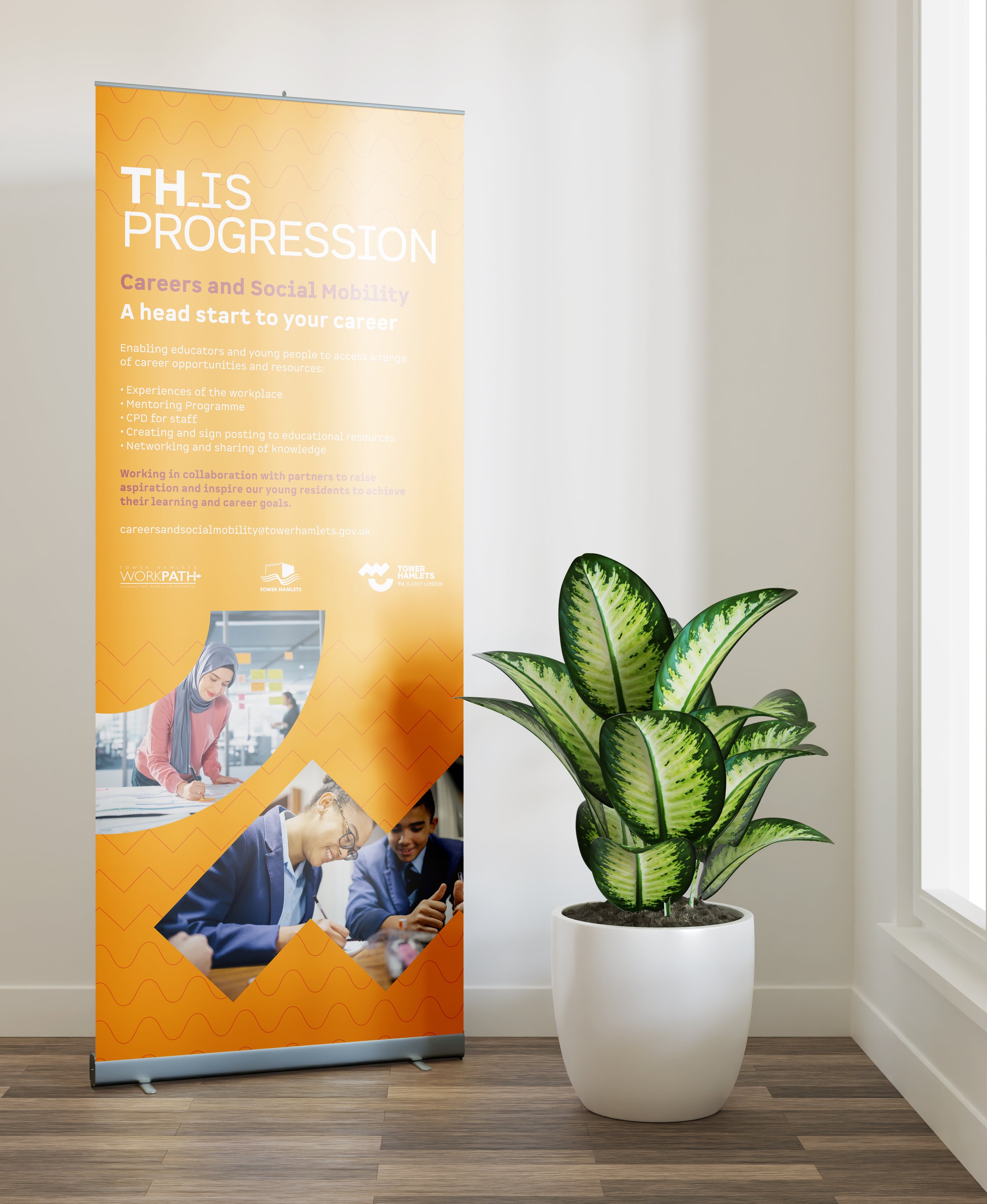
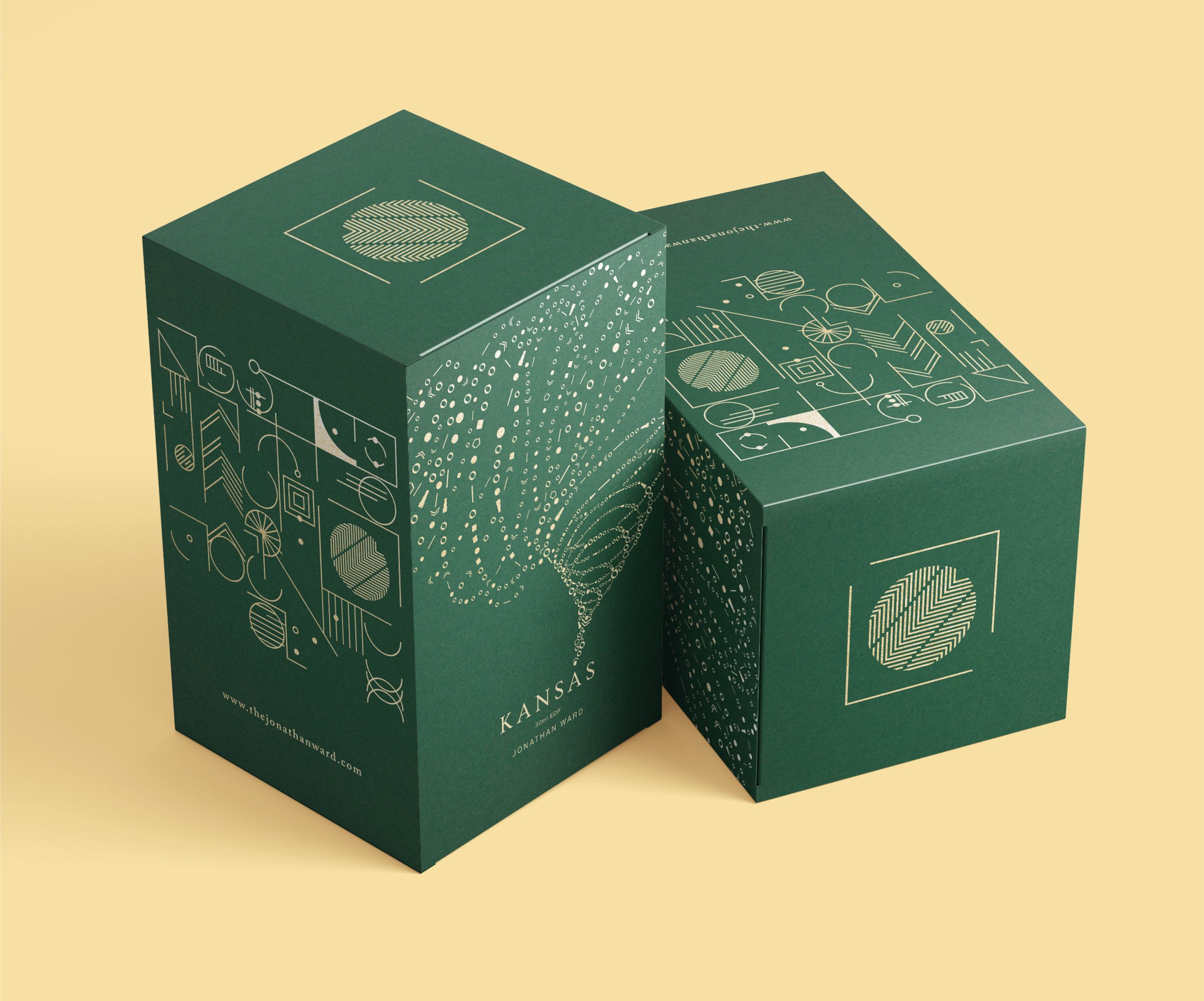
Design and illustration for perfume boxes
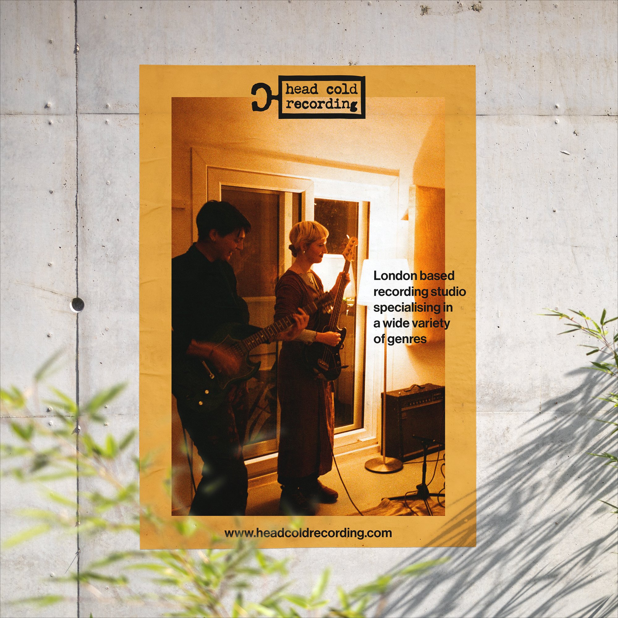
Logo, brand and website design for a new South London recording studio.
www.headcoldrecording.com
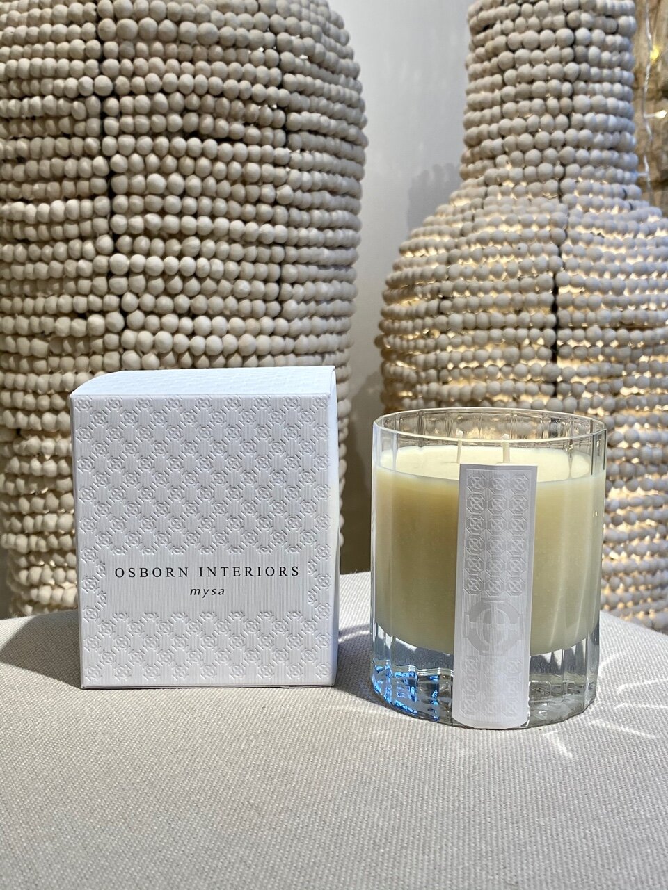
Packaging and label design for this collaboration between Osborn Interiors and Jonathan Ward.
The boxes are an all over emboss with matt foil lettering.
packaging design / typesetting
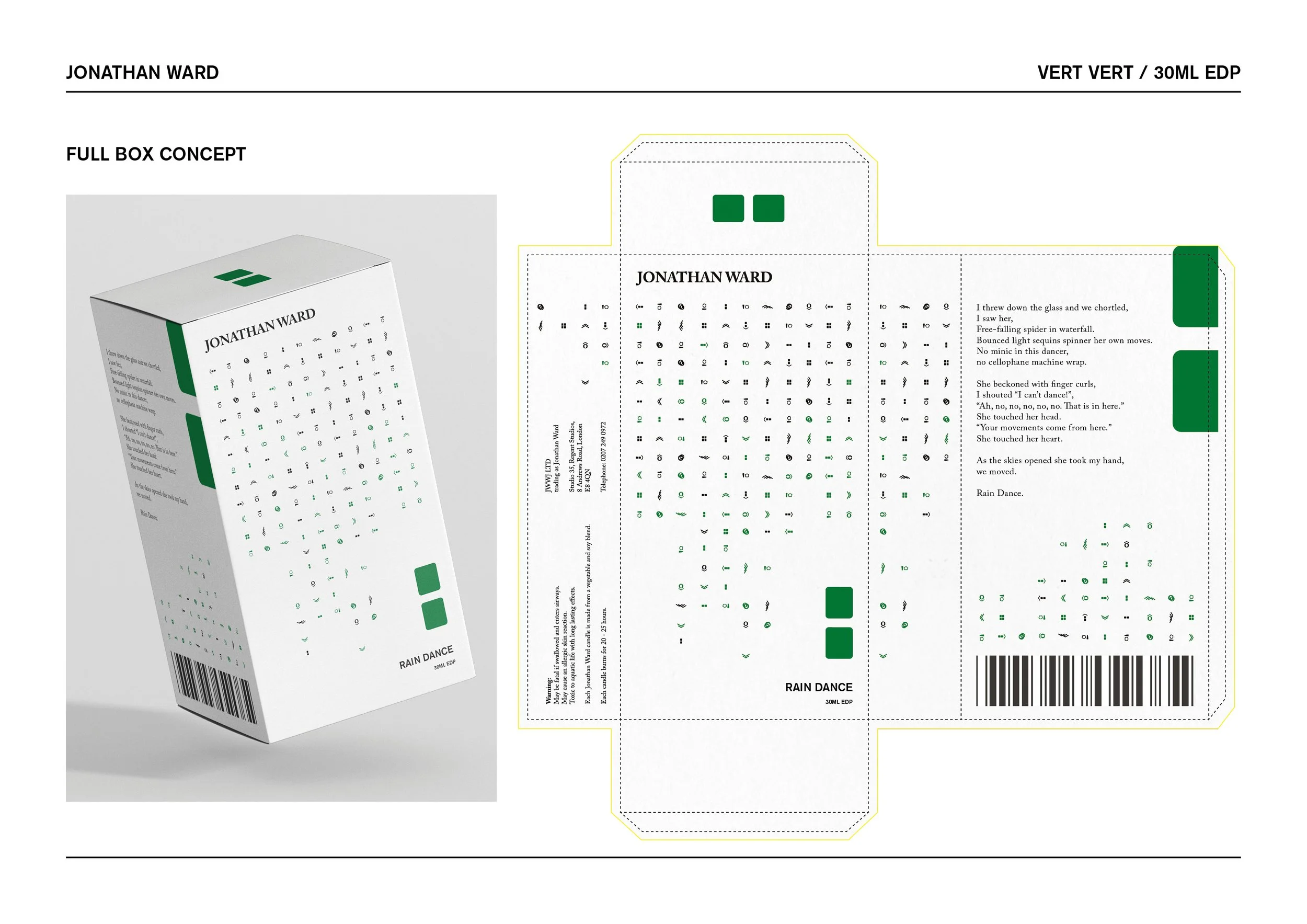
Packaging concepts for a new Jonathan Ward line.
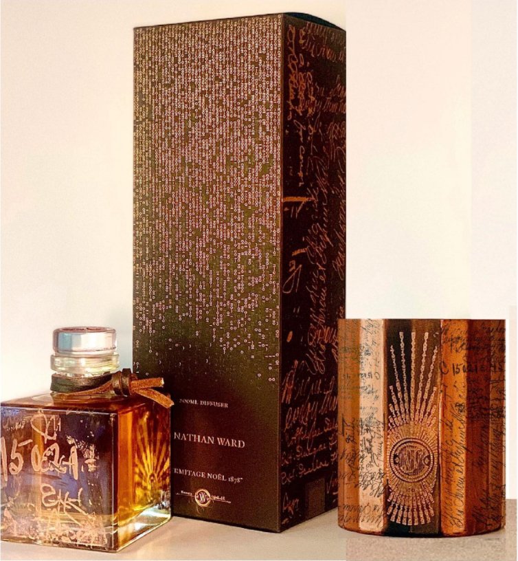
Packaging design for boxes and on-body of candles and diffuser bottles. Preparing artwork for the laser cutting machine used to create the on-body work was a new one for me, it’s amazing how fine it can go.
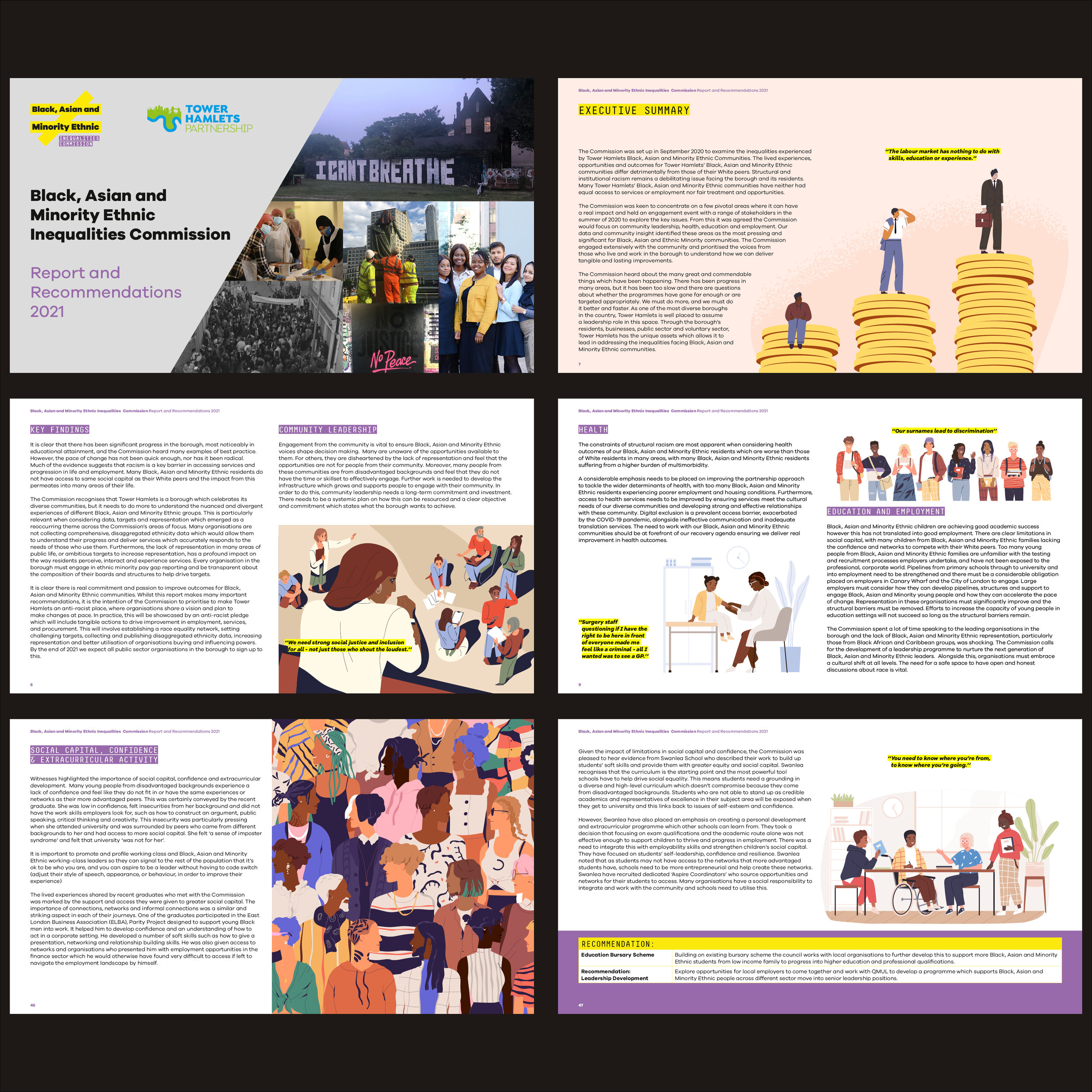
Working on this project is the essence of why I moved in to the public sector. I wanted to not only earn money with my career, but do something that made a difference to other people’s lives. Working for a council can be challenging for many reasons, but projects like this make it all worth it.
I worked on this from its inception, creating the branding and some promotional social media assets. This report is the culmination of the hard work of many people and it was a great pleasure to play my part.
You can read the full report and find out more here: https://www.towerhamlets.gov.uk/lgnl/community_and_living/Inequality-Commission/Black-Asian-and-Minority-Ethnic-Inequalities-Commission.aspx
branding / editorial design
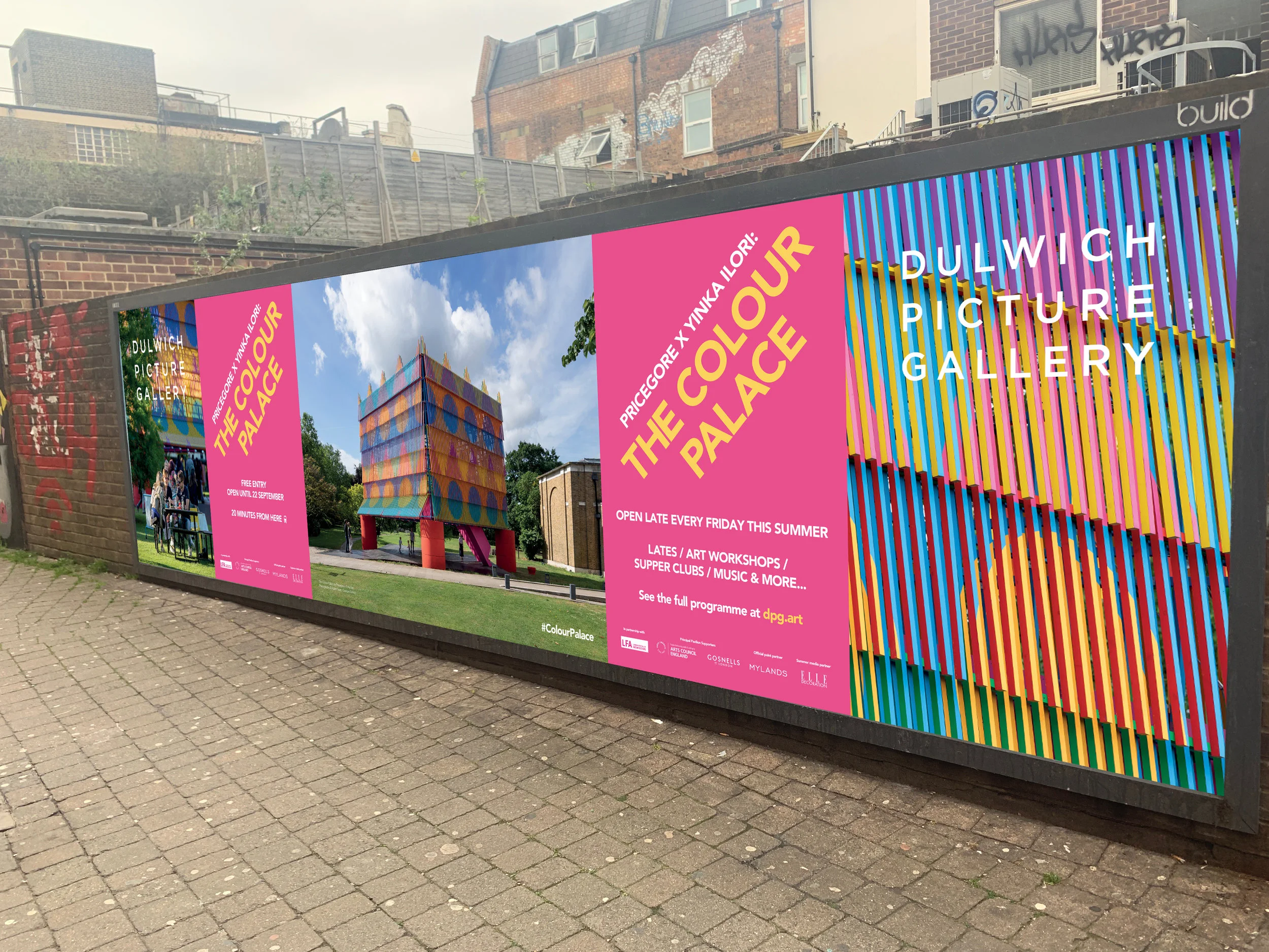
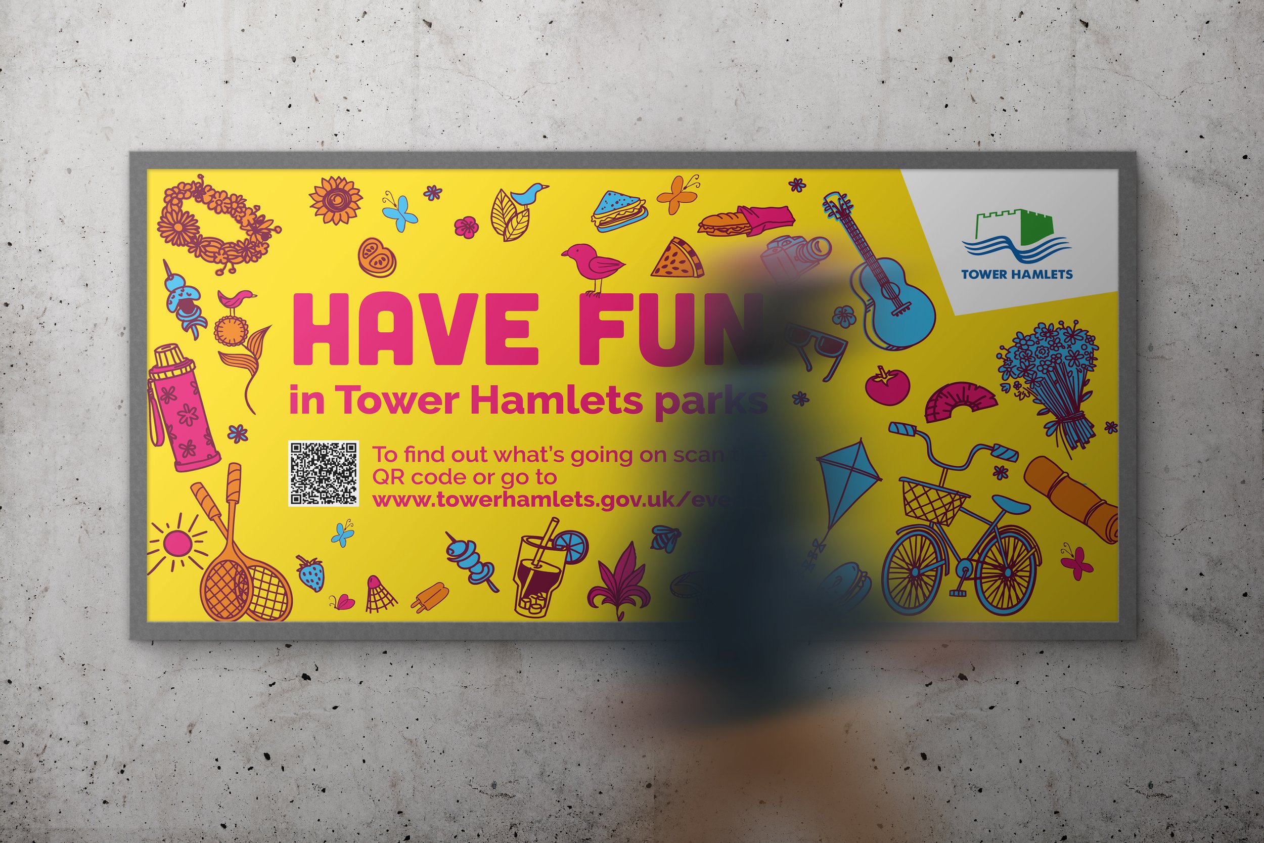
Outdoor 6x4 sheet design for Dulwich Picture Gallery and The Colour Palace.
artworking / design / large format
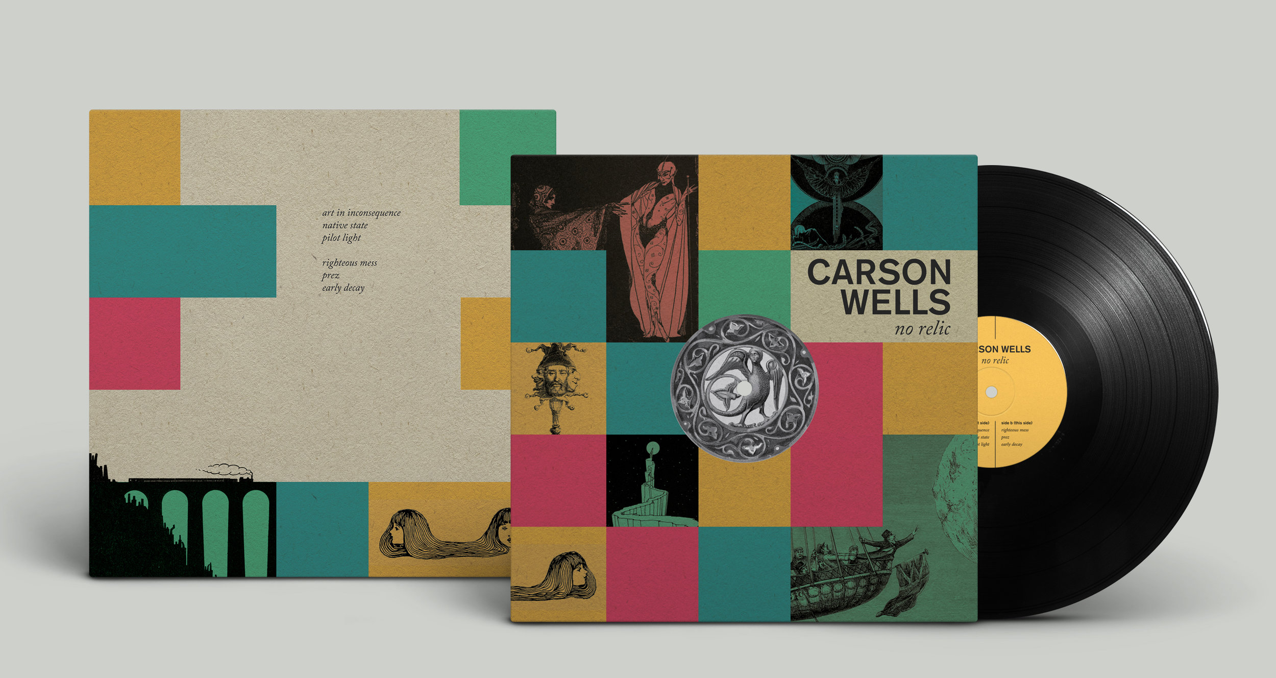
LP sleeve design for Carson Wells’ third LP ‘No Relic’. The band wanted something bright and vibrant which also captured the tone of the record. I developed this design around the idea of the ephemera we collect and experience in our journey through life. ‘No Relic’ very much felt like a collection of memories and reactions to those memories to me, and I wanted to reflect that in the design.
The physical product itself is a standard 12” sleeve, but with a hole in the centre which reveals the onbody artwork of the record itself inside. To me this is a continuation of the idea of ‘seeing in’ to the band’s collection of feelings and memories.
design / illustration / typography / packaging
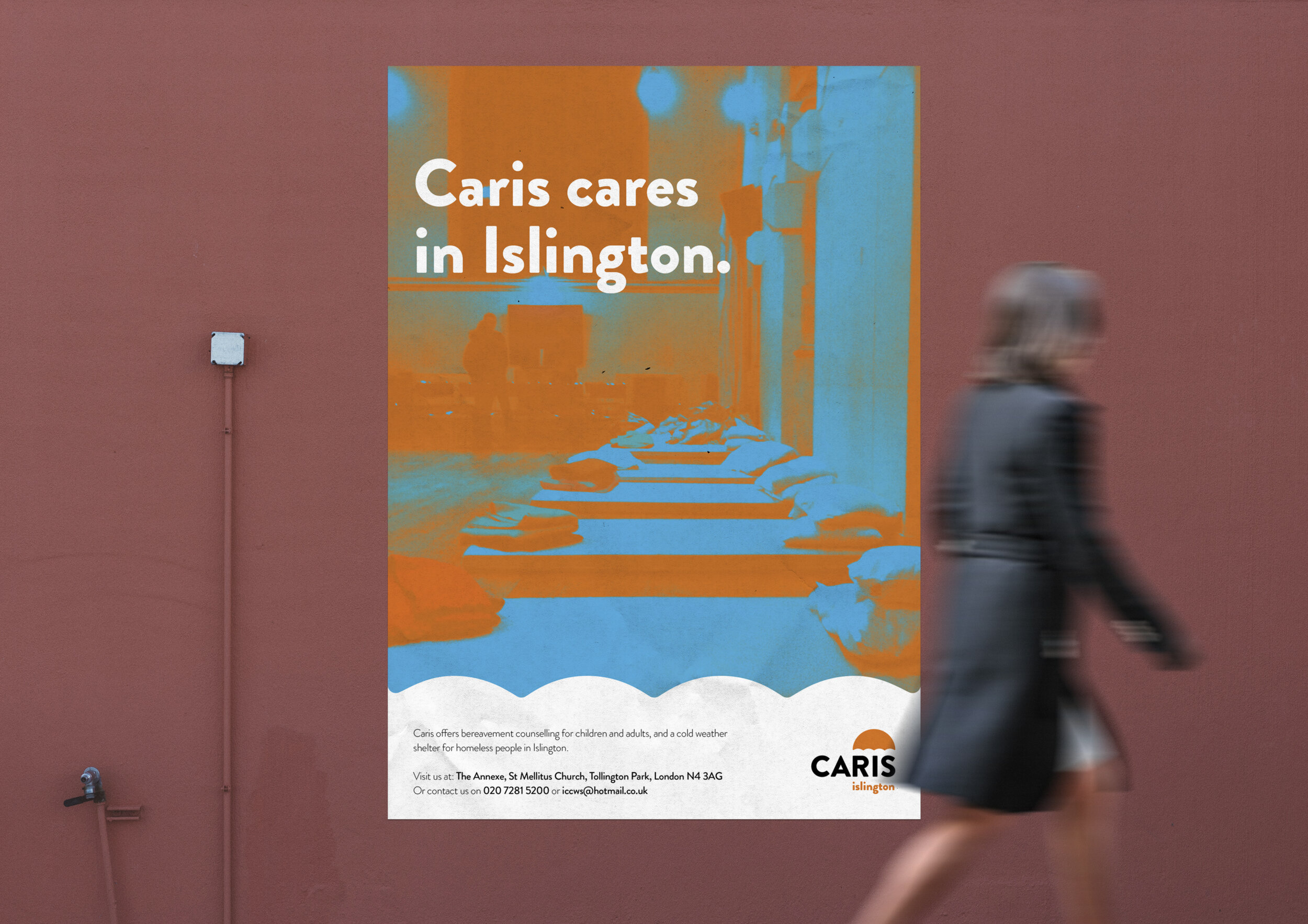
Complete identity and marketing assets for CARIS Islington. CARIS provide a vital service, offering a cold weather shelter and bereavement counselling for those in need.
branding / logo / marketing
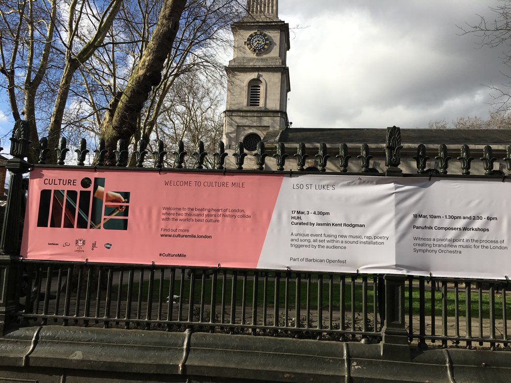
The Culture Mile is a project aiming to bring higher visibility to all the attractions in the area of London surrounding the Barbican. This project saw me working with City of London, Barbican, Guildhall School of Music & Drama, London Symphony Orchestra and the Museum of London.
The original identity was designed by Pentagram. My task was to develop that identity slightly to work alongside the partner logos, and put it in action across a variety of applications and formats.
This banner was outside St Luke’s for LSO and part of an array of large format signage I created for Barbican’s OpenFest. Initial concepts suggested by the marketing team based on the original Pentagram brand were not working for many of the required applications, so I developed this new two tone design.
artworking / design / large format
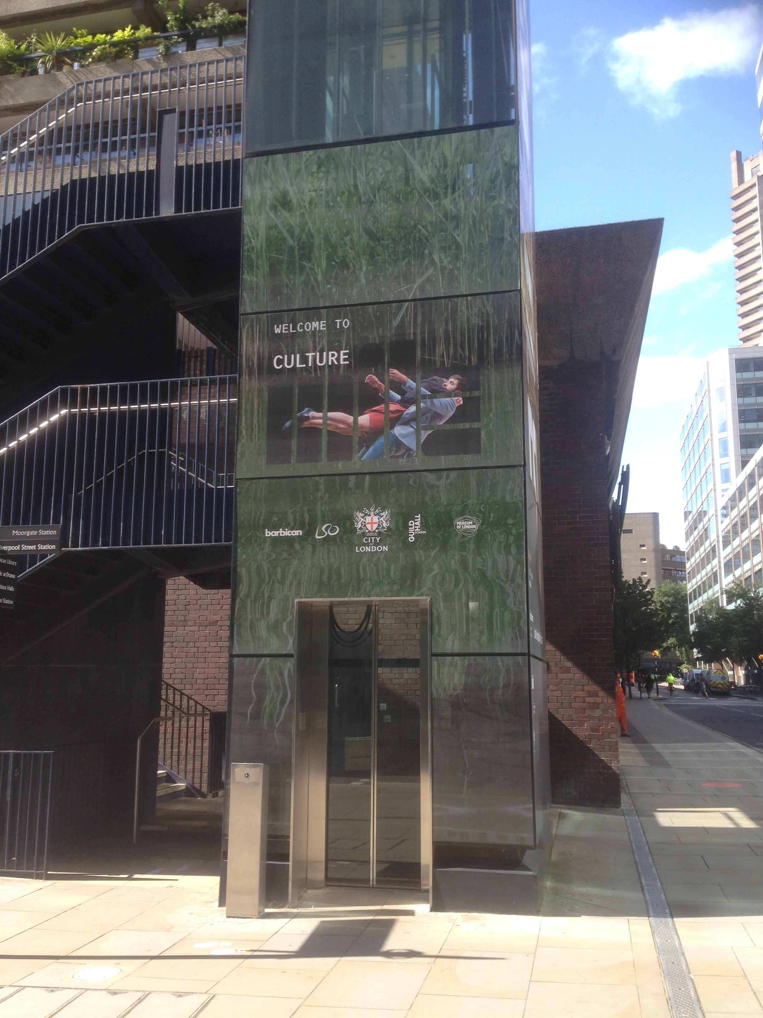
The Culture Mile is a project aiming to bring higher visibility to all the attractions in the area of London surrounding the Barbican. This project saw me working with City of London, Barbican, Guildhall School of Music & Drama, London Symphony Orchestra and the Museum of London.
The original identity was designed by Pentagram. My task was to develop that identity slightly to work alongside the partner logos, and put it in action across a variety of applications and formats.
These lifts are one of the first pieces that I worked on that are now out in the wild, much more to come!
artworking / design / large format
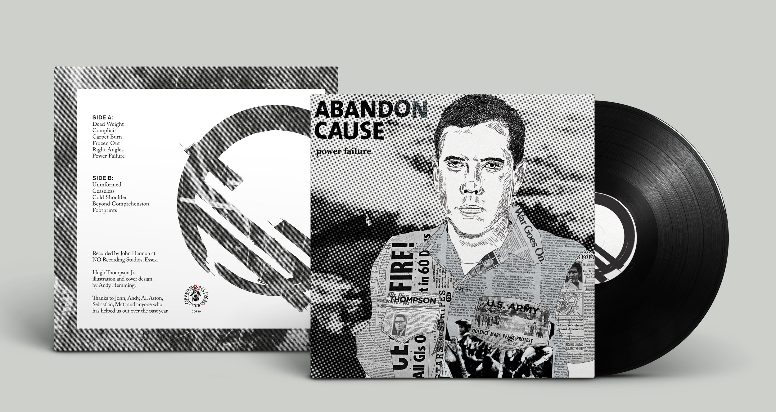
LP sleeve illustration and design for Abandon Cause.
design / illustration / typography / duotone
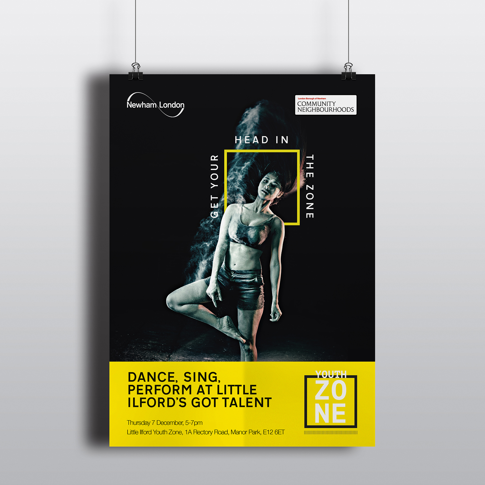
I was presented with the challenge or rebranding Newham's Youth Zone project - bringing together 13-18 year olds with free activities. The old brand was tired, unloved and very much looked like something designed by someone who didn't understand what visually appeals to people of that age range. The most important idea was to avoid the feeling of condescension towards young people and make everything feel more high end.
design / branding / typography
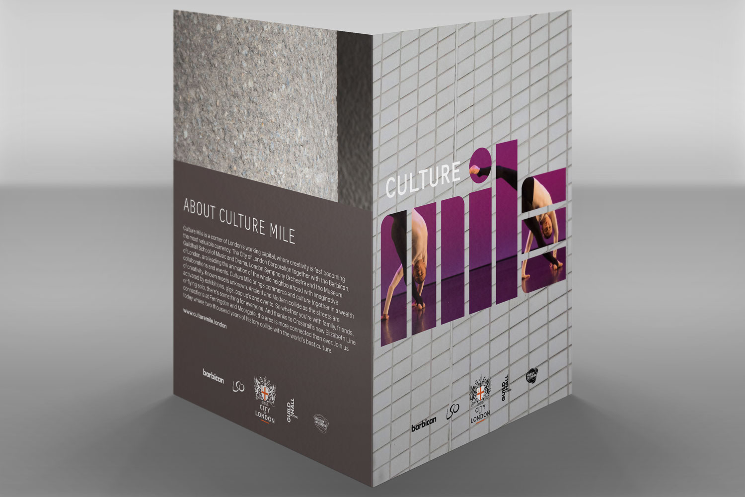
The Culture Mile is a project aiming to bring higher visibility to all the attractions in the area of London surrounding the Barbican. This project saw me working with City of London, Barbican, Guildhall School of Music & Drama, London Symphony Orchestra and the Museum of London.
The original identity was designed by Pentagram. My task was to develop that identity slightly to work alongside the partner logos, and put it in action across a variety of applications and formats.
These promotional packs are one of the first things we created and aim to strongly project the look and feel of Culture Mile.
artworking / design / large format
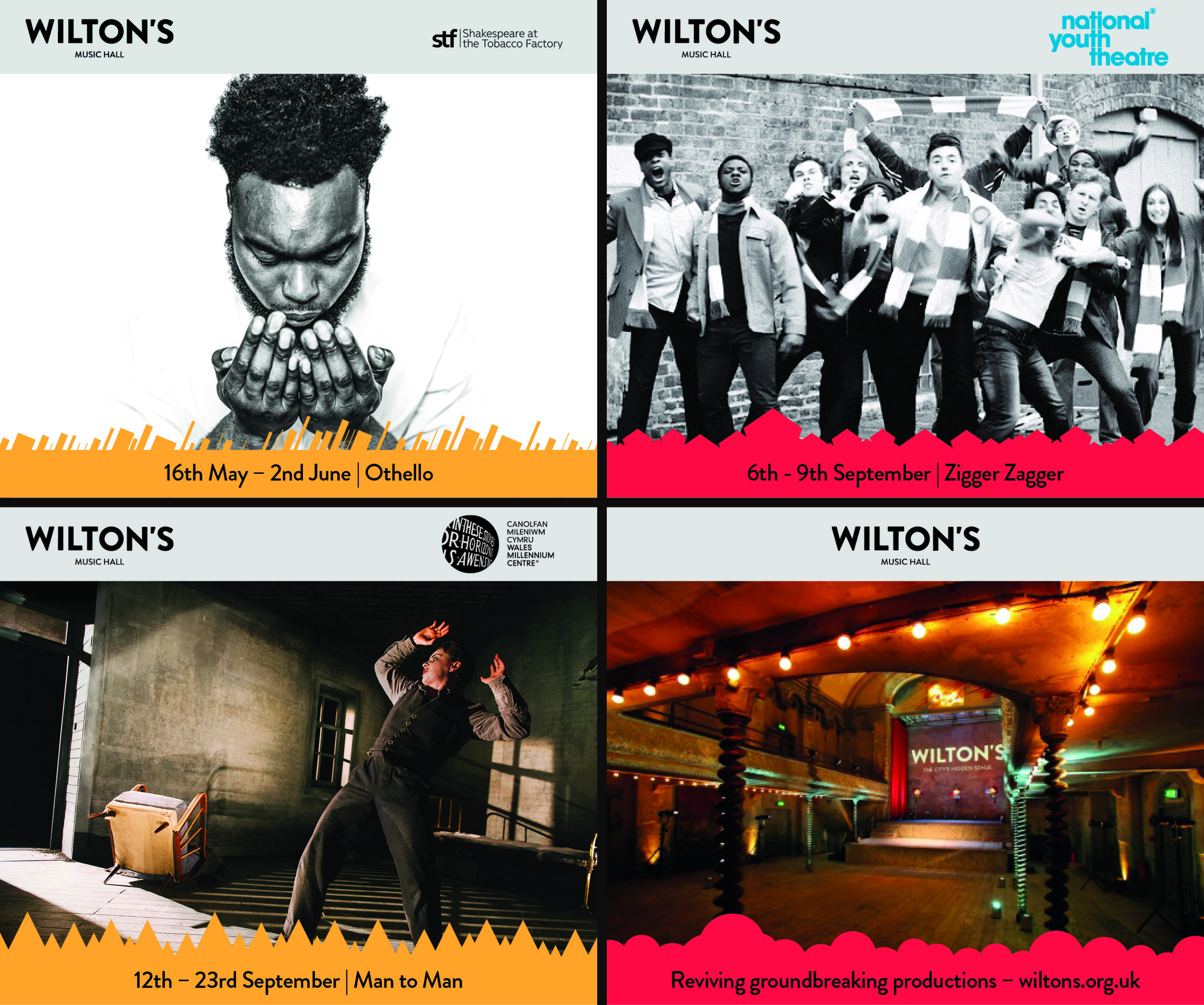
Digital leaderboard ads for Wilton's winter season productions
design / branding / typography
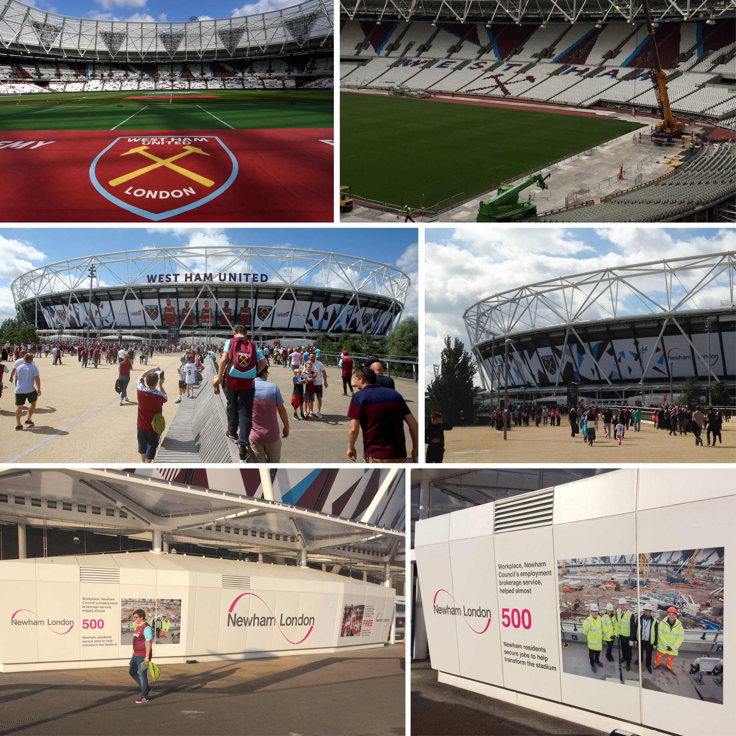
I worked as part of a team to help create the new look and feel for what is now the London Stadium (formerly the Olympic Stadium). The whole project encompassed three different organisations with different goals. Ultimately it was a case of each party trying to get what they wanted and reaching a compromise. The final design took elements from all three parties, with my artwork mainly being displayed on the outer wrap of the stadium, in the seating areas (coloured seating patterns, West Ham logo and lettering) and on the 'pods' outside the stadium (bottom two images on the collage).
large format graphics / branding / pattern / transformation / sports / stadium
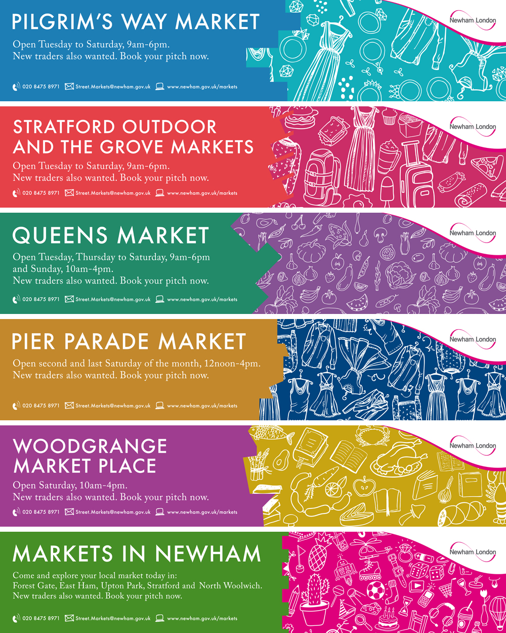
A set of banners to refresh the look and feel of Newham's many markets. We wanted to create something that evoked the unique and diverse feel of each market as well as the borough itself.
Advertising / marketing / typography
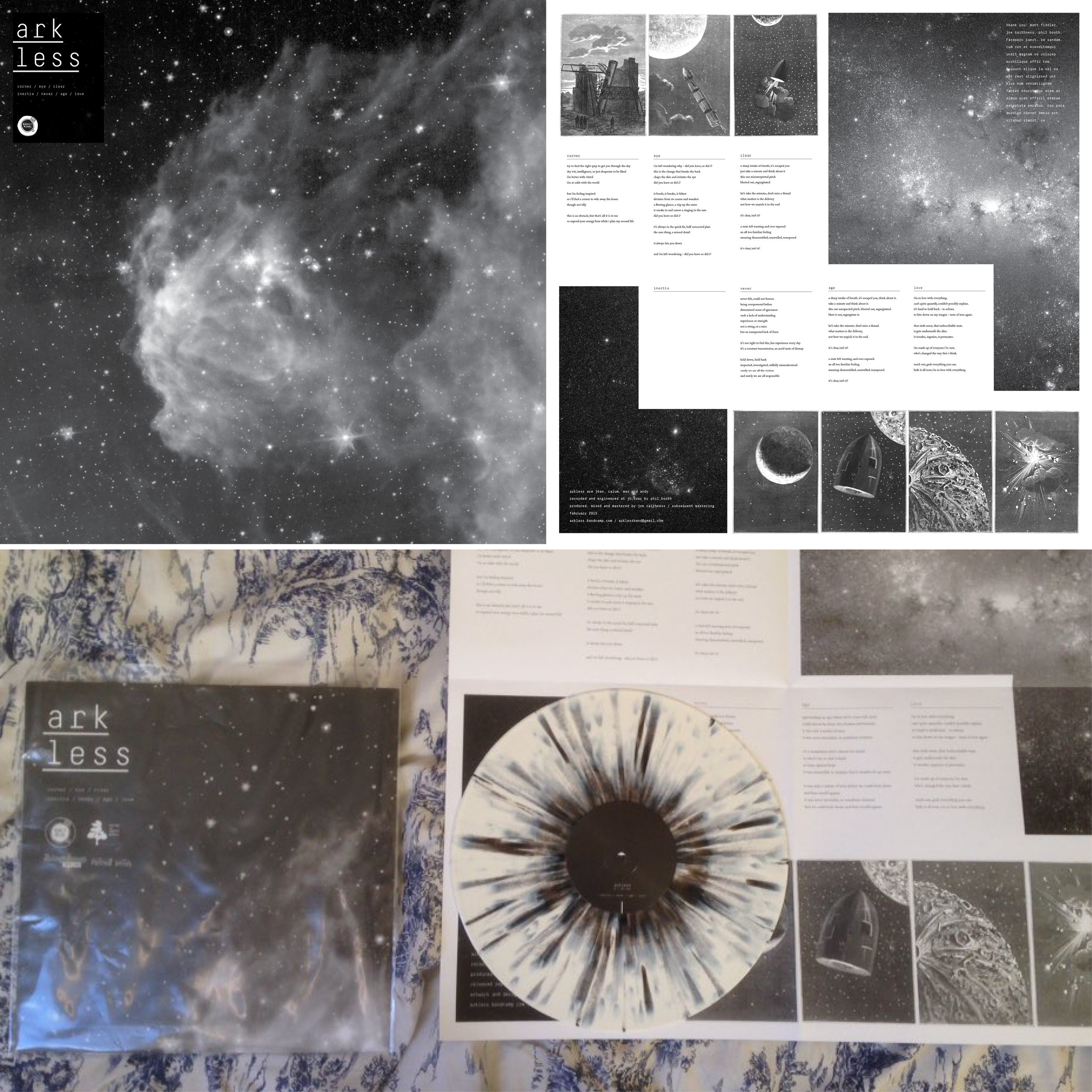
Artwork for the debut Arkless LP. Instead of creating a standard back/front/spine 12" cover we created a huge 63x63cm poster which folds out when you take the record out of the sleeve. The artwork contains a collection of illustrations from a vintage book on space travel released into the public domain by the British Library. The space images are from the Hubble Telescope.
album artwork / collage / typography / layout
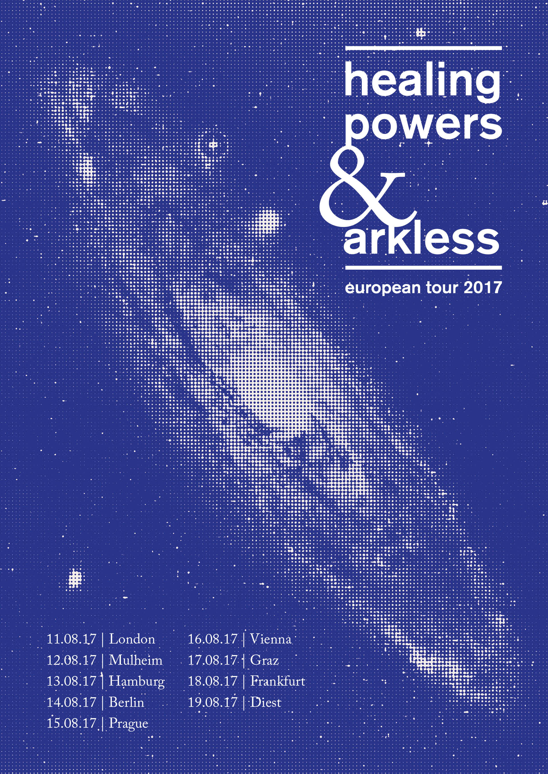
Tour poster to be screen printed and sold for the Healing Powers and Arkless summer 2017 European tour.
halftone / poster design / typography
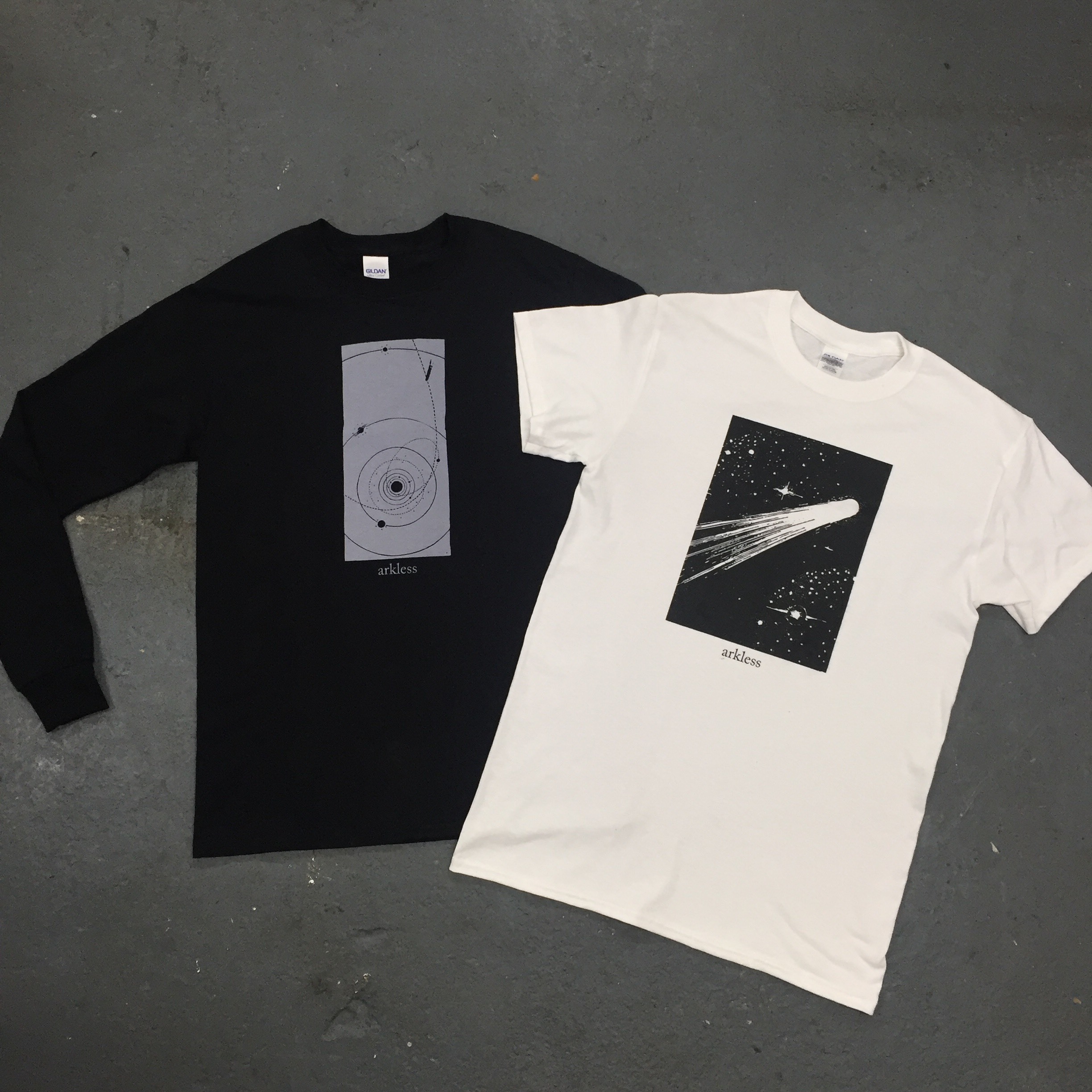
1 colour illustration. Screenprinted by Vino Sangre.
Illustration / typography / design / t-shirt design / layout / screenprinting
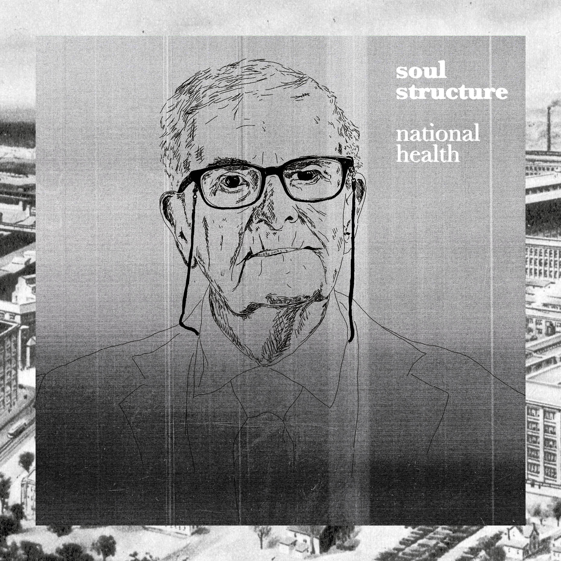
Artwork for Soul Structure's 'National Health' EP. Illustration of Harry Leslie-Smith collaged with images of old NHS hospitals and a photocopier texture to give something to anchor it all together.
album artwork / collage / typography / layout
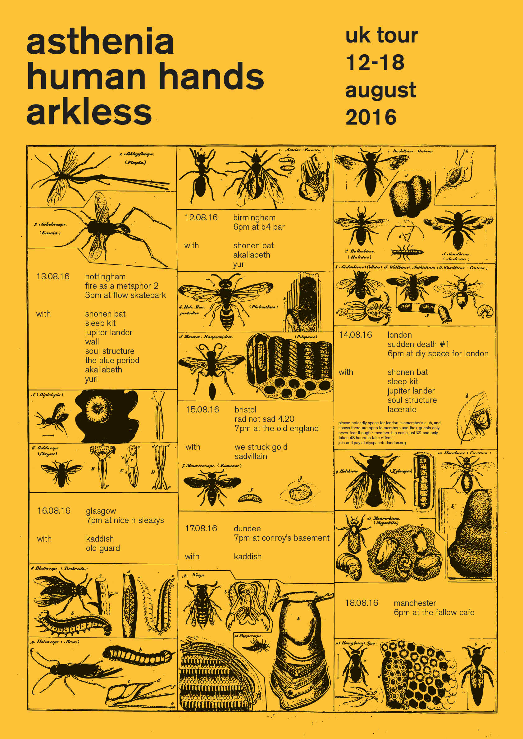
Tour poster for Asthenia / Human Hands / Akless 2016 UK tour. To be screen printed and sold on tour as well as used as promo.
collage / poster design / typography
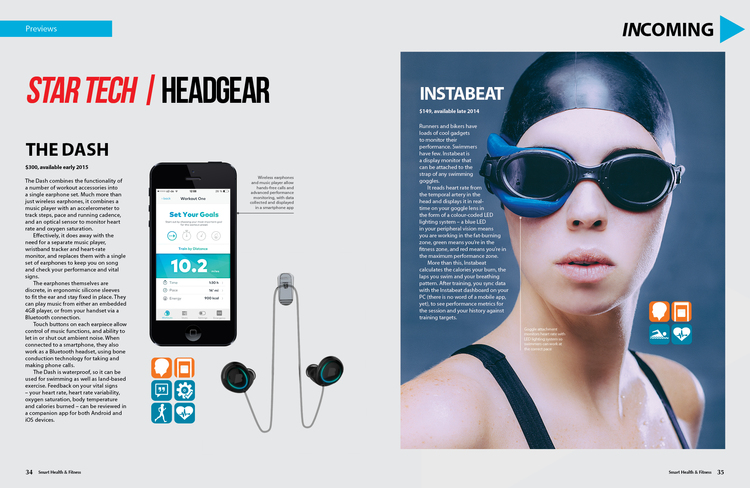
A magazine focusing on the use of new 'smart technology' products - reviews, editorials, tutorials etc.
Design / artworking / art direction / art editing / photo manipulation / layout / editorial / typography
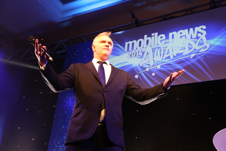
Design, artworking and art direction of all collateral for major industry awards night. Print material including menus, table numbers, banners etc. Design of backgrounds and artwork to appear on screens. Design and typography for awards presentation on screen.
Design / artworking / art direction / typography / illustration / layout / large format / set dressing / production design
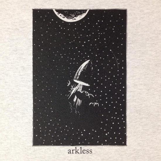
1 colour illustration. Screenprinted by Vino Sangre.
Illustration / typography / design / t-shirt design / layout / screenprinting
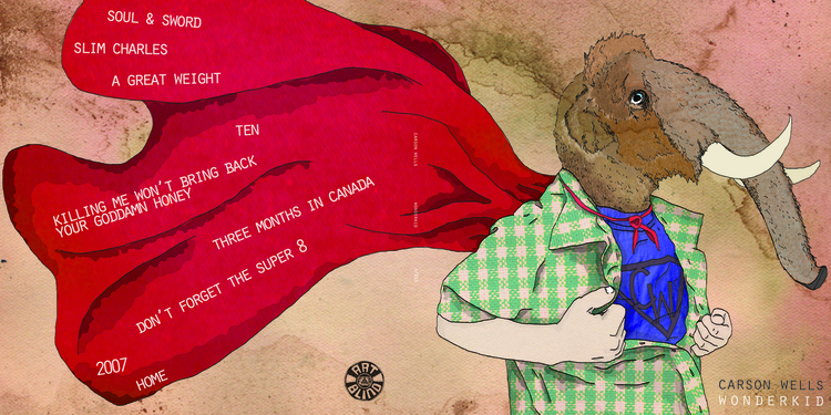
Illustration and design for Carson Wells' first LP - 'Wonderkid'.
Illustration / hand drawn / design / typography / layout / texture / collage
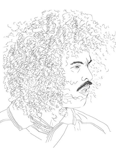
One colour illustration from my zine 'Real Men: The Lost Art of the Football Tache'.
Illustration / hand drawn
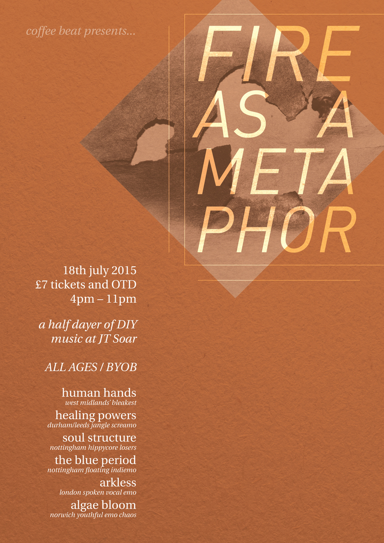
Event poster for an all day gig in Nottingham, July 2015.
Poster / layout / typography / collage / texture
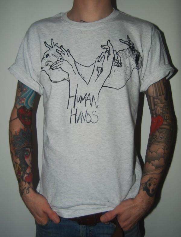
One colour illustration for Human Hands (band) t-shirts.
Illustration / hand drawn / hand drawn text / screenprinting
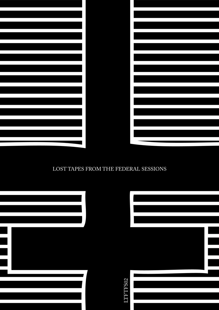
Cover for 'Lost Tapes From the Federal Sessions', a zine reviewing the DIY punk scene in 2010. Interviews with and pictures of bands from all over the UK as well as some from abroad. I designed the zine itself and submitted illustrations for some of the pages.
Cover design / typography / layout / art direction
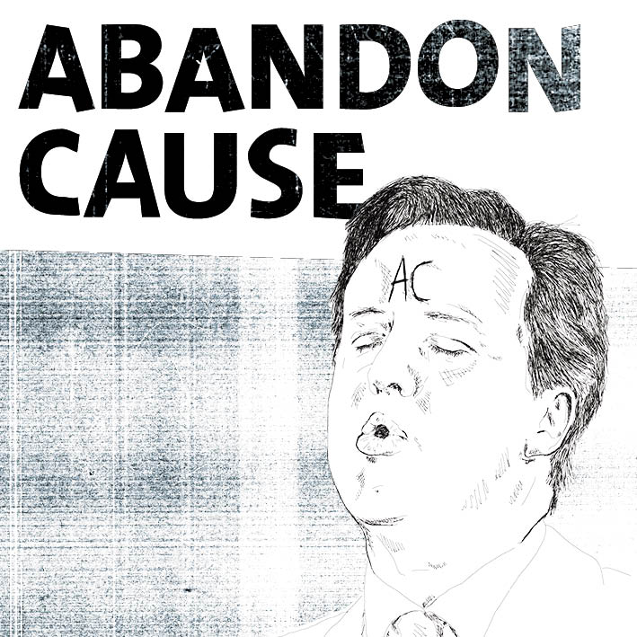
Illustration and design for Abandon Cause album artwork
illustration / layout / collage / typography
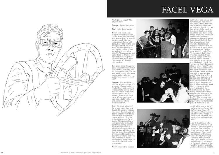
Spread from 'Lost Tapes From the Federal Sessions', a zine reviewing the DIY punk scene in 2010. Interviews with and pictures of bands from all over the UK as well as some from abroad. I designed the zine itself and submitted illustrations for some of the pages. The illustration on this spread is one of mine.
Cover design / typography / layout / art direction


Album cover design for the band Waterdeer. The brief was to create something with ‘no people, no animals and not too many colours’. I took inspiration from cyanotypes, using the lyrics, themes and feel of the music to drive my image research.
I was tasked with developing an identity for Communities of Liberation, a historical research and public art project which aims to increase awareness of the long history of the African presence in the borough of Tower Hamlets, by focusing specifically on excavating and sharing stories of individuals who lived here in the 17th and 18th centuries.
Exhibition design of 7 1×2m monoliths to walk visitors through the complex work of the co-producers of this project. We also created a coffee table book of their work as a companion piece.
Full box design, including all over pattern work, set up for gold foil and embossing, typesetting of labels and preparation for production.
Design, layout and typesetting for this long format delve in to all the ephemera included in the Tower Hamlets Library and Archives ‘Cockney Rebels’ exhibition running Q3 2024 - Q1 2025
I worked with the Tower Hamlets Library and Archives team to put together a full identity for their late summer audio visual exhibition 'Everything is different, nothing has changed'. This included the design and production of wayfinding and information panels for the exhibition itself, marketing online and in print across the borough, as well as a programme for the event.
Design and illustration for perfume boxes
Logo, brand and website design for a new South London recording studio.
www.headcoldrecording.com
Packaging and label design for this collaboration between Osborn Interiors and Jonathan Ward.
The boxes are an all over emboss with matt foil lettering.
packaging design / typesetting
Packaging concepts for a new Jonathan Ward line.
Packaging design for boxes and on-body of candles and diffuser bottles. Preparing artwork for the laser cutting machine used to create the on-body work was a new one for me, it’s amazing how fine it can go.
Working on this project is the essence of why I moved in to the public sector. I wanted to not only earn money with my career, but do something that made a difference to other people’s lives. Working for a council can be challenging for many reasons, but projects like this make it all worth it.
I worked on this from its inception, creating the branding and some promotional social media assets. This report is the culmination of the hard work of many people and it was a great pleasure to play my part.
You can read the full report and find out more here: https://www.towerhamlets.gov.uk/lgnl/community_and_living/Inequality-Commission/Black-Asian-and-Minority-Ethnic-Inequalities-Commission.aspx
branding / editorial design
Outdoor 6x4 sheet design for Dulwich Picture Gallery and The Colour Palace.
artworking / design / large format
LP sleeve design for Carson Wells’ third LP ‘No Relic’. The band wanted something bright and vibrant which also captured the tone of the record. I developed this design around the idea of the ephemera we collect and experience in our journey through life. ‘No Relic’ very much felt like a collection of memories and reactions to those memories to me, and I wanted to reflect that in the design.
The physical product itself is a standard 12” sleeve, but with a hole in the centre which reveals the onbody artwork of the record itself inside. To me this is a continuation of the idea of ‘seeing in’ to the band’s collection of feelings and memories.
design / illustration / typography / packaging
Complete identity and marketing assets for CARIS Islington. CARIS provide a vital service, offering a cold weather shelter and bereavement counselling for those in need.
branding / logo / marketing
The Culture Mile is a project aiming to bring higher visibility to all the attractions in the area of London surrounding the Barbican. This project saw me working with City of London, Barbican, Guildhall School of Music & Drama, London Symphony Orchestra and the Museum of London.
The original identity was designed by Pentagram. My task was to develop that identity slightly to work alongside the partner logos, and put it in action across a variety of applications and formats.
This banner was outside St Luke’s for LSO and part of an array of large format signage I created for Barbican’s OpenFest. Initial concepts suggested by the marketing team based on the original Pentagram brand were not working for many of the required applications, so I developed this new two tone design.
artworking / design / large format
The Culture Mile is a project aiming to bring higher visibility to all the attractions in the area of London surrounding the Barbican. This project saw me working with City of London, Barbican, Guildhall School of Music & Drama, London Symphony Orchestra and the Museum of London.
The original identity was designed by Pentagram. My task was to develop that identity slightly to work alongside the partner logos, and put it in action across a variety of applications and formats.
These lifts are one of the first pieces that I worked on that are now out in the wild, much more to come!
artworking / design / large format
LP sleeve illustration and design for Abandon Cause.
design / illustration / typography / duotone
I was presented with the challenge or rebranding Newham's Youth Zone project - bringing together 13-18 year olds with free activities. The old brand was tired, unloved and very much looked like something designed by someone who didn't understand what visually appeals to people of that age range. The most important idea was to avoid the feeling of condescension towards young people and make everything feel more high end.
design / branding / typography
The Culture Mile is a project aiming to bring higher visibility to all the attractions in the area of London surrounding the Barbican. This project saw me working with City of London, Barbican, Guildhall School of Music & Drama, London Symphony Orchestra and the Museum of London.
The original identity was designed by Pentagram. My task was to develop that identity slightly to work alongside the partner logos, and put it in action across a variety of applications and formats.
These promotional packs are one of the first things we created and aim to strongly project the look and feel of Culture Mile.
artworking / design / large format
Digital leaderboard ads for Wilton's winter season productions
design / branding / typography
I worked as part of a team to help create the new look and feel for what is now the London Stadium (formerly the Olympic Stadium). The whole project encompassed three different organisations with different goals. Ultimately it was a case of each party trying to get what they wanted and reaching a compromise. The final design took elements from all three parties, with my artwork mainly being displayed on the outer wrap of the stadium, in the seating areas (coloured seating patterns, West Ham logo and lettering) and on the 'pods' outside the stadium (bottom two images on the collage).
large format graphics / branding / pattern / transformation / sports / stadium
A set of banners to refresh the look and feel of Newham's many markets. We wanted to create something that evoked the unique and diverse feel of each market as well as the borough itself.
Advertising / marketing / typography
Artwork for the debut Arkless LP. Instead of creating a standard back/front/spine 12" cover we created a huge 63x63cm poster which folds out when you take the record out of the sleeve. The artwork contains a collection of illustrations from a vintage book on space travel released into the public domain by the British Library. The space images are from the Hubble Telescope.
album artwork / collage / typography / layout
Tour poster to be screen printed and sold for the Healing Powers and Arkless summer 2017 European tour.
halftone / poster design / typography
1 colour illustration. Screenprinted by Vino Sangre.
Illustration / typography / design / t-shirt design / layout / screenprinting
Artwork for Soul Structure's 'National Health' EP. Illustration of Harry Leslie-Smith collaged with images of old NHS hospitals and a photocopier texture to give something to anchor it all together.
album artwork / collage / typography / layout
Tour poster for Asthenia / Human Hands / Akless 2016 UK tour. To be screen printed and sold on tour as well as used as promo.
collage / poster design / typography
A magazine focusing on the use of new 'smart technology' products - reviews, editorials, tutorials etc.
Design / artworking / art direction / art editing / photo manipulation / layout / editorial / typography
Design, artworking and art direction of all collateral for major industry awards night. Print material including menus, table numbers, banners etc. Design of backgrounds and artwork to appear on screens. Design and typography for awards presentation on screen.
Design / artworking / art direction / typography / illustration / layout / large format / set dressing / production design
1 colour illustration. Screenprinted by Vino Sangre.
Illustration / typography / design / t-shirt design / layout / screenprinting
Illustration and design for Carson Wells' first LP - 'Wonderkid'.
Illustration / hand drawn / design / typography / layout / texture / collage
One colour illustration from my zine 'Real Men: The Lost Art of the Football Tache'.
Illustration / hand drawn
Event poster for an all day gig in Nottingham, July 2015.
Poster / layout / typography / collage / texture
One colour illustration for Human Hands (band) t-shirts.
Illustration / hand drawn / hand drawn text / screenprinting
Cover for 'Lost Tapes From the Federal Sessions', a zine reviewing the DIY punk scene in 2010. Interviews with and pictures of bands from all over the UK as well as some from abroad. I designed the zine itself and submitted illustrations for some of the pages.
Cover design / typography / layout / art direction
Illustration and design for Abandon Cause album artwork
illustration / layout / collage / typography
Spread from 'Lost Tapes From the Federal Sessions', a zine reviewing the DIY punk scene in 2010. Interviews with and pictures of bands from all over the UK as well as some from abroad. I designed the zine itself and submitted illustrations for some of the pages. The illustration on this spread is one of mine.
Cover design / typography / layout / art direction